
The short answer is no. Normal distributions do not exist in the real-world business scenarios. Usually the data we receive have a uniform distribution rather than a “perfect bell curve”. The real question is: Do we need perfection in data to be able to analyze. NO. Perfect normal distributions are beautiful though they are theoretical. However, we still use the theory of normal distributions in the real business world. How do we do that?
Let’s first take a look at the definitions.
Statistical Distributions
What do we mean by distributions? Let’s think that you are rolling a dice and recording the results. You roll a 2 and then a 5, a 6, then a 3… Outcome of you rolling the dice creates a distribution.
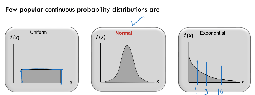
A uniform distribution (often called ‘rectangular’) is one in which all values between two boundaries occur roughly equally. For example, if you roll a six-sided die, you’re equally likely to get 1, 2, 3, 4, 5, or 6. If you rolled it 6,000 times, you’d probably get roughly 1,000 of each result. The results would form a uniform distribution from 1 to 6.
The time between arrivals at service facilitates, time to failure of systems, flood occurrence, etc., can be modeled as exponential distributions.
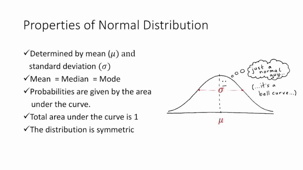
A normal distribution is usually symmetric about the mean (average of the observed values). It shows that, the values occur more frequently near the mean rather than the values away from the mean. We encounter many examples of processes that produce normal distributions. For example, the height of females of a certain race is normally distributed (but not the height of all people of the race, which will have two spikes or modes, one centered on the average height of men, the other of women). Whenever an outcome is really the sum (or average) of the outcomes of a number of uncertain quantities―different or the same―the probability distribution of the outcome is frequently a normal distribution. In fact, one of the most famous theorems in statistics, the central limit theorem, implies this directly: If you have enough uncertain quantities going into the accumulation, the resulting distribution of the sum (or average) will be normal.
Let’s learn the parameters of normal distribution.
Mean: Average of all the values.
Median: Value in the middle. Consider you have 11 variables. The 6th variable is your median.
Mode: The value most frequently occurs.
Range: Different between the minimum and the maximum value.
IQR: The interquartile range (IQR), also called the midspread, middle 50%, or H‑spread, is a measure of statistical dispersion, being equal to the difference between 75th and 25th percentiles, or between upper and lower quartiles, IQR = Q3 − Q1.
Variance: the spread between numbers in a data set. More specifically, variance measures how far each number in the set is from the mean and thus from every other number in the set.
Standard Deviation: square root of Variance. It tells you how spread out your observed values.
How to determine the normality of your data?
Well, there are few things you can look to determine normality. First, I would suggest looking at descriptive statistics. You can do that in excel easily. Go to Data in the menu and make sure you have Data Analysis tool enabled.
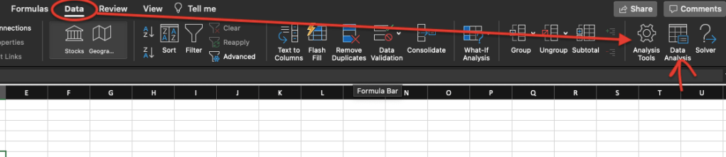
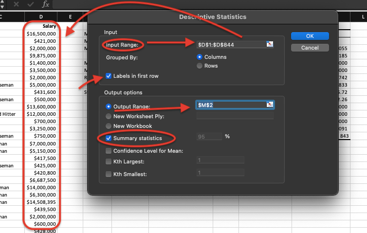
If you click on Analysis Tools, you can enable “Analysis ToolPak. After you do that, you will see “Data Analysis” section in the menu. After you select your data, click on Data Analysis and you will see a screen as below:
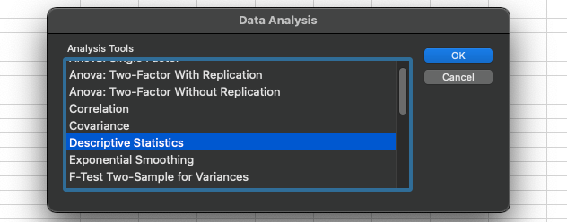
You will see many options there you can use for your data; we will discover all later but for now, select “Descriptive Statistics” and click OK. You will end up with as a window below. For the Input Range, select your data, in my case I select my salary data. Because I select the first row which is the label, I put a check mark to “Labels in first row”. Then I select and output range which is where I would like to display the outcome. Lastly, click on the summary statistics which will display all the parameters we just learn and will learn. Make sure everything is on track and click OK.
You should end up with a table similar below:
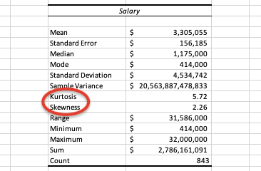
The values you get won’t be the same as I used a different dataset but, see how excel calculates everything you need in seconds. Some simple parameters display above in the table I explained earlier in the post, I will deep dive more with my later posts but right now I would like you to focus on “Skewness and Kurtosis”.
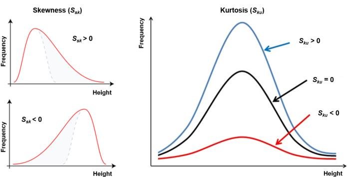
In determining the normality, we look for skewness is close to 0 and kurtosis is close to 3. In real life we never get actual skewness of 0 and kurtosis of 3 but anything close to that we consider as normal distribution and apply all the statistical methods that requires normal distribution. However, our goal is to make our data closer to normal. For example, if our data rightly skewed (means skewness higher than 0), we should work on the outliers in our data before moving to further analysis. Same thing if out skewness is less than 0 (left skewed).
Another way to look at normality is creating a histogram and hunt for the “bell shape”. In excel, using the same Data Analysis tool, we can also create histogram of our data to visually determine normality.
Before you go to Data, Data Analysis and select Histogram in the list, you need to create bins for your data. Most people get confused about this process; I will show you my tricks to get through it. Let me tell you how a histogram works.
Histogram is basically a bar chart but, instead of putting the entire data in a bar chart, histogram takes bins in the x-axis. Bins are basically data ranges, like if your data ranges between 1 and 100, you may pick your bins as 0 to 50 and 50 to 100. You may also create more bins. It’s totally up to you and what you are trying to accomplish for your analysis. I will show you what did I do for my salary dataset.
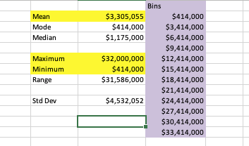
I take a look at max and min values of my data and also check the mean value. I start with my min value and keep adding 3000, which is about my mean value, till I get something close to my max value. This usually works. After I created the bins, I got to Data-Data Analysis, select histogram and click OK.
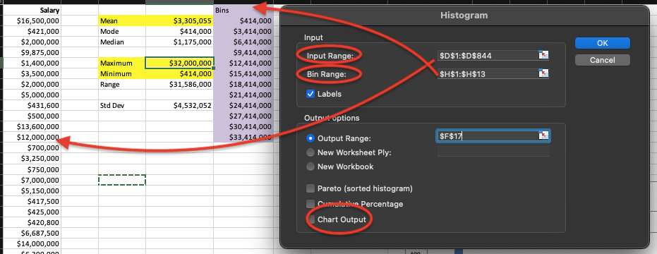
Select your data range, and also select your bin range as you created. Do not forget to checkmark on Chart Output. Click OK.
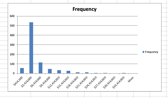
You should get a chart like above. Based on your data you may get different shapes. In my case, I have kind of a bell shape but it’s highly rightly skewed. This makes sense as we found out that the skewness of my data was 2.26. Moving forward, I should find out what’s make my data rightly skewed and see if I can do some data cleaning to put my data in a better shape.
Conclusions:
- In real life, we don’t deal with perfectly normal data but it’s possible to use nearly normal data for statistical analysis requires normal distribution.
- Skewness and Kurtosis are important to determine normality. (S=0, K=3)
- You can use excel to get descriptive statistics to help you understand normality.
- You can also create histogram in Excel to do a visual check of your data.
- If you find your data is skewed, you should work on it, especially with the outliers (extreme values) in your data before moving forward.
Resources:
Robert Stine_ Dean Foster – Statistics for Business_ Decision Making and Analysis-Pearson (2017)
https://www.investopedia.com/terms/n/normaldistribution.asp
https://towardsdatascience.com/do-my-data-follow-a-normal-distribution-fb411ae7d832
